"Hugo Asm" <hua### [at] post3 tele tele dk> wrote:
> Sure I like it! And welcome to the group. :-)
Thanks. :-)
> I must say, this image is good enough already and easily qualifies as a
> first post. But to give a few suggestions, since I'm writing anyway: I think
> the image would benefit from stronger colours (mainly on the balls) and
> reflections with better proportion between specular highlight and indirect
> light. To achieve this, you could raise the ambience of the neon-light
> cylinders (there is no need to mess with the level of reflection on the
> ball - material), assuming the entire room isn't lit by radiosity... If the
> entire room is lit by radiosity, you should lower the radiosity-brightness
> value, in addition to raising the ambience of the light-cylinders...
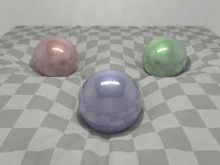
Well, I tried several options with the colours and the ambient value.
Unfortunately I was not able to achieve the right effect without a
light_source so I added one additionally to the ambient cylinder.
Do you like it better like this?
ciao
Mischa dk> wrote:
> Sure I like it! And welcome to the group. :-)
Thanks. :-)
> I must say, this image is good enough already and easily qualifies as a
> first post. But to give a few suggestions, since I'm writing anyway: I think
> the image would benefit from stronger colours (mainly on the balls) and
> reflections with better proportion between specular highlight and indirect
> light. To achieve this, you could raise the ambience of the neon-light
> cylinders (there is no need to mess with the level of reflection on the
> ball - material), assuming the entire room isn't lit by radiosity... If the
> entire room is lit by radiosity, you should lower the radiosity-brightness
> value, in addition to raising the ambience of the light-cylinders...
Well, I tried several options with the colours and the ambient value.
Unfortunately I was not able to achieve the right effect without a
light_source so I added one additionally to the ambient cylinder.
Do you like it better like this?
ciao
Mischa
Post a reply to this message
Attachments:
Download '3_spheres_2.png' (307 KB)
Preview of image '3_spheres_2.png'

|


![]()